For people who don’t know Mydoh, it’s a fresh, new way for parents to help their kids understand the whole “money thing.” The Mydoh app is innovative, fun and easy to use. And we needed a visual brand identity that could convey that to all the new people we’ll be meeting. A brand identity is the visual expression of a brand. It conveys who you are, what you do and what you stand for. Think of the logos of brands you already connect with.
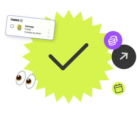
Here’s a little background. With Mydoh, parents can set tasks, their kids do the tasks, and they get paid—for doing the tasks! All in the app (well, except for the task-doing part). When kids start earning their own money, it can change how they think about money—and how they spend money.
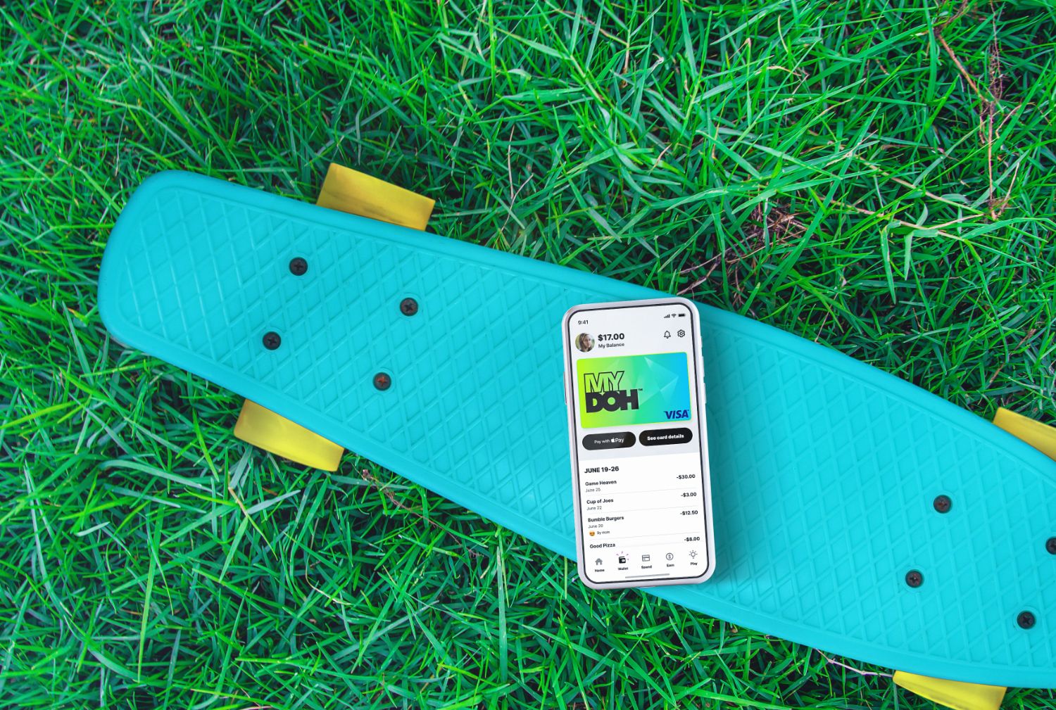
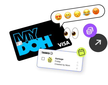
That’s where the Smart Cash Card comes in. It’s both a digital and physical cash card that allows kids to check their balance and see any earnings they have coming in before making difficult purchase decisions online and in-store (up to the allowable limits): Like, do you get a large or small frozen mocha fantasy, with or without whipped cream—and what about sprinkles? It can add up.
Mydoh also gives kids a head start in financial literacy, with easy, fun trivia on topics ranging from how to make a budget, which can solve the whipped cream dilemma and help kids plan for future purchases.
Kids learn through Mydoh Play, earn through Mydoh tasks and spend wisely with the Smart Cash Card.
As a parent, you can coach, guide or just keep an eye on things. You can track your kids’ spending activity and react with emojis 👍 . Plus, you can lock and unlock their Smart Cash Cards at any time from the app. Basically, Mydoh empowers parents to help the next generation master money skills.
That’s a lot to fit in a logo!
We turned to the Strategic Design group at RBC Ventures to capture the energy and personality of Mydoh and squeeze it all into a snappy new brand ID. We chatted with some of the creators and asked them about the branding process and how we got where we are today.
Hector: The Mydoh rebrand project was personal to me. As the parent of a teenager and part of a family that actually uses the product, the branding would have to resonate with me. I was also lucky to have my own consumer test audience with my son. I bounced ideas off him and shared progress along the way.
Our team at SD comprises highly talented strategists, creative directors, writers and designers who are passionate about creating something truly special. The creative exploration process took us to many different visual territories. We eventually landed on a kind of ’90s nostalgia vibe. The colours are bright, the typography is bold, the photography is real, the illustrations are quirky, and the overall feeling is confident, fun and positive. This approach resonated with the whole team, parents and kids included, and I’m very excited about the results.
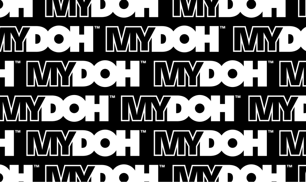
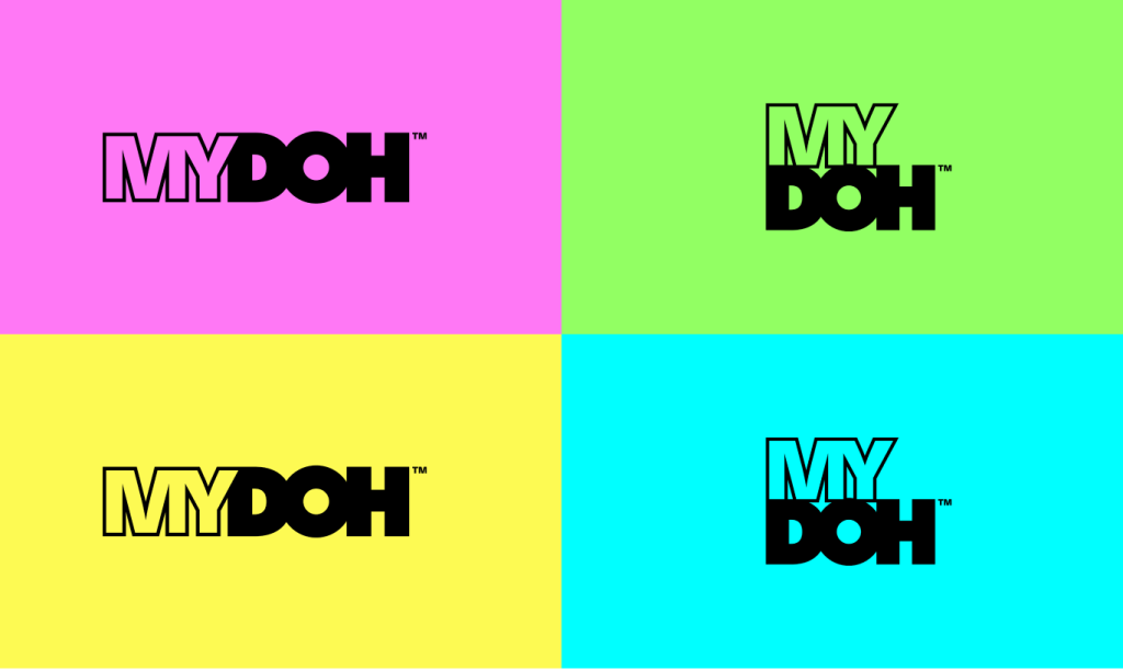
Peter: The logo or wordmark is the keystone in our visual design system. It’s the main way people identify a brand. We wanted a logo that would be noticed. We chose a really heavy weight for the font and then customized it to make it even chunkier. Black is the anchor colour of the MYDOH logo, and it sets our brand apart, but the colour is an important part of the rebrand. Neon colours really help the logo pop!
The MY part of MYDOH is open and acts as a window or blank canvas. We can see colour and action through it or fill it with paint strokes or scribbles. Mydoh is a bold, energetic brand that welcomes everyone. And, I think we’ve landed on a wordmark that really conveys that.
Lionel: They didn’t teach money skills in school when I was a kid, so I was really intrigued by the financial literacy aspect of the Mydoh app. The fact that Mydoh makes it easy for kids to learn by doing—making decisions and maybe even making mistakes and course-correcting—is so important. That’s how you build a financial foundation. I wish I knew then what I know now.
Mydoh is a new way of thinking about money in a brand new category. It was critically important that what we created would be original and ownable and that the Mydoh look and feel and brand voice would be distinct and memorable. We had to be bold, approachable, engaging and inviting. Whether we’re talking about our in-app journey or a YouTube ad campaign, Mydoh had to stand out and stand apart as a truly unique brand.
Angela: The imagery we use says a lot about us as a brand. So, we’ve been very thoughtful in selecting who we show and how we present them. The parents and kids in our shots are from a truly diverse range of ethnicities and cultural backgrounds and represent varying abilities. Our diversity is genuine and honest, and the kids are truly individual. We want to capture familiar, relatable, real-life moments.
I’m an aunt to a couple of teenagers, so I see the real money conversations that my sister and her husband have with my nephews; parents and kids negotiating, working together and building a stronger relationship. Mydoh understands the needs of parents and kids, and our imagery needs to do the same. The look has to be of the moment, relevant and real.

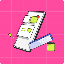
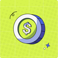
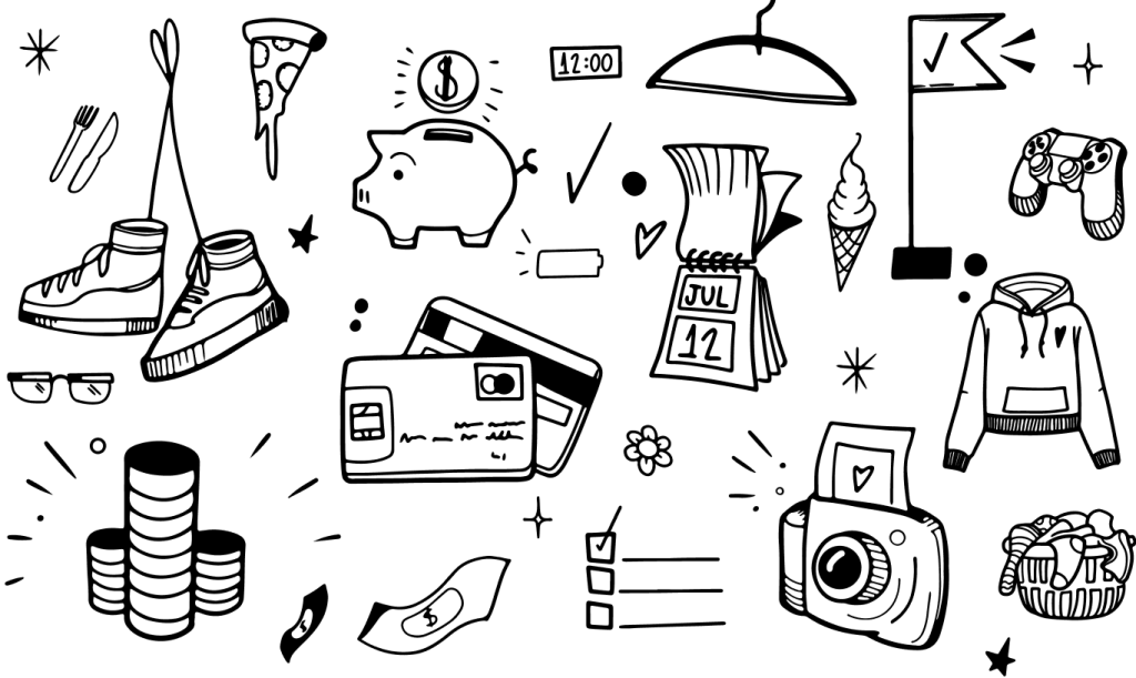
Tadeu: On my first day at Ventures, I joined the Mydoh rebrand team and started bringing the illustrations and animations to life. Illustrations help with storytelling and become a key part of our visual language. They support messaging across the application, emails, social media, website and advertising.
Whether we’re talking about finances or food, they help express our fun, energetic personality. Fast-paced animations are colourful, energetic, and, you guessed it—fun! Wherever people meet Mydoh, they’ll have the same holistic experience.
My daughter is still young, but I’d really like her to have good financial skills when she grows up. I can see how Mydoh facilitates money talks with parents and kids, bringing them together and reducing stress. Our new brand captures the personality of Mydoh, and I hope that parents and kids recognize our enthusiastic, empathetic voice: You can trust Mydoh to help you help your kids learn about money. I look forward to helping my daughter with Mydoh of the future.
Download the Mydoh app to help your kids earn, learn and spend. Smart.
This article offers general information only and is not intended as legal, financial or other professional advice. A professional advisor should be consulted regarding your specific situation. While the information presented is believed to be factual and current, its accuracy is not guaranteed and it should not be regarded as a complete analysis of the subjects discussed. All expressions of opinion reflect the judgment of the author(s) as of the date of publication and are subject to change. No endorsement of any third parties or their advice, opinions, information, products or services is expressly given or implied by Royal Bank of Canada or its affiliates.
